Double Page Spread Comparison
This page is a comparison between two separate magazines on there double page spread. Comparing these will give me a overall opinion on what I should include when creating my own double page spread
|
|
Kid Cudi
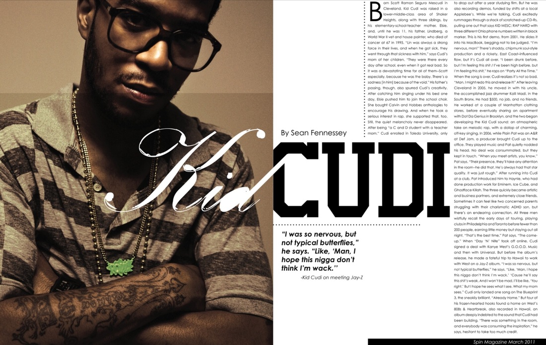
The colour within the photography is always tied within the text design colour scheme this is something that works very well as well as the Kid Cudi magazine the image is very dark and has a slight yellow tint to it such as an old camera has been used in this photo shoot. I really like the idea of a simple image going into a design I find the more detailed and edited seem to look less effective when reading an article, this is something that is always used within the magazine design process, the selection of photography because it is so important.
Jay Z
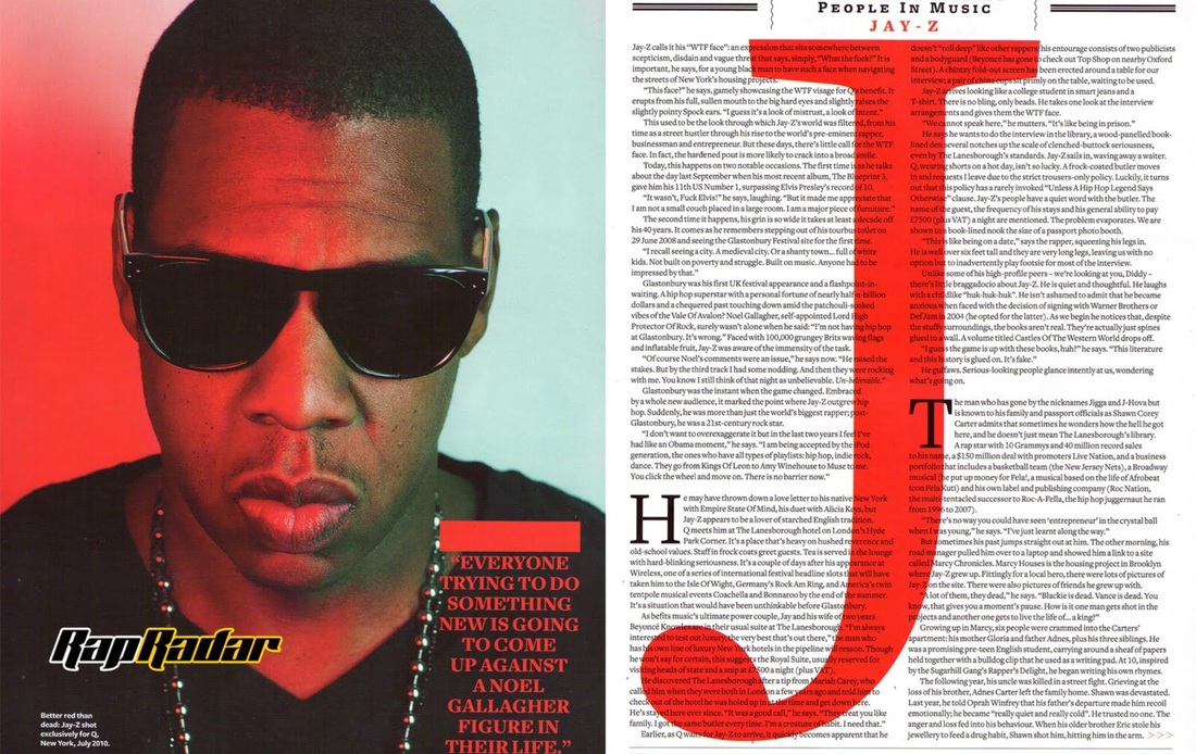
The image of Jay-Z takes up one page of the double page spread and thus enforces his presence on the article. In the image we see Jay-Z's face and shoulders, yet his shoulders are cut off, he cannot fit on the page, possible due to his broad shoulders, due to the power he now holds. He is wearing black sunglasses along with a black t-shirt. This is consistent with his overall image, he is known for wearing 'all black everything'. The sunglasses completely conceal his eyes and give a feeling that there are many things that remain untold and that possibly he could tell them in this article. The sunglasses add emphasis to his trademark mouth and lips which have helped make his career and fortune. The t-shirt he wears is a V-neck, this could possibly suggest victory. The necklace around his neck is a symbol of his wealth. The image is cast with a red wash-like effect on one side. Red are the colour of the Q magazine logo and also a colour of passion, love and blood. The other side is white, a colour of purity and cleanliness, perhaps suggesting Jay-Z is now tainted and his purity is disappearing. This could well apply as he is known to have had an unsavoury past. This relates to Jay-Z trying to achieve equality, power and wealth as a black American.
Red is used again as a quote from the interview is placed on Jay-Z's shoulder. He is talking about the adversity he met from Noel Gallagher when he headlined at Glastonbury and the colour red demonstrates the power he showed to overcome it. The quote also relates to him breaking down cultural and social stereotypes.
The Rap Radar logo stands out and does not follow the house style. The font and colours used are unique to the double page. For those who do not know what Rap Radar is, they could be forgiven for thinking Rap Radar is radar for rap, and that Jay-Z is under this radar, he has been found.
The large red J behind the text in a serif font is a mirror image of the Q magazine logo, yet it is a J, because the interview is about 'Jay-Z'. The whole text is in a sans serif font which holds with the classy, upper-end look of Q magazine. All over the double page, Jay-Z and other key words are highlighted in red, the colour of power, passion and Q magazine.
Both double page spreads are on the music genre associated with rap, Spin magazine is talking about the rapper/singer/song writer Kid Cudi whereas Q magazine is talking about Jay Z.
Mise En Sense
There is a clear comparison between the two magazines and I will start with the image, both images relate around intimidating poses of the artist themselves, this gives a sense of fear to the audience to show them they are not afraid of anything as they are looking directly at the reader. The facial expressions on the artists are very bland and emotionless they look like robots instead of humans which further supports my point about them being intimidating as you would associate people of the ordinary kind to smile in photographs. The props used in the images are shades and chains which is very stereotypical of the artists to wear, people always assume this certain culture of music to black shadey males who come across very arrogant and very confident in what they do. The majority of the rappers have extravagant facial hair and tattoos to further come across intimidating this also shows that they are not afraid of the general public as they will do as they please. There costume also has very dark and mysterious colours which relates to the low key lighting this also relates to big J in Q magazine the red behind the artist which connotes danger and also to show that he is the leader which is cleverly used over the double page spread.
Headline
Surprisingly only the Q magazine with Jay Z only has a headline. This is placed at the top of the right hand centre page which says the most exciting people in music promoting that they only show the best.
Subject Name
Both artists’ names are placed in the centre of the page; this is useful as it’s the main feature that the audience eye is attracted too.
Stand first
Is the text underneath the main heading of a magazine article? In this one only Kid Cudi’s magazine has the text an introductory paragraph in an article, printed in larger or bolder type or in capitals, which summarizes the article. The effect it creates has that people would rather read a short description about the magazine rather than the whole magazine as it gives them a taster to what’s in the full story.
Main Body
The main body is the main article, this is on both magazines that is mainly separated into columns with around 500-650 words. These are in the font sizes 10 or 12. You can see that in these pages the two are interviews funnily enough about each other.
Drop Cap
The drop cap happened a lot in all rap magazines, in both of these articles you can see that there is normally, at the start of a paragraph, a bold letter bigger than all the others on the page, this shows us on both magazines where the paragraph begins as it grabs your attention the most.
Byline
Bylines are where the photographer and the authors names are displayed to take credit in their work, this is the least important piece of information simply because the reader does not care; they want to read about the superstars not the person who made the magazine.
The colour within the photography is always tied within the text design colour scheme this is something that works very well as well as the Kid Cudi magazine the image is very dark and has a slight yellow tint to it such as an old camera has been used in this photo shoot. I really like the idea of a simple image going into a design I find the more detailed and edited seem to look less effective when reading an article, this is something that is always used within the magazine design process, the selection of photography because it is so important.
Jay Z
The image of Jay-Z takes up one page of the double page spread and thus enforces his presence on the article. In the image we see Jay-Z's face and shoulders, yet his shoulders are cut off, he cannot fit on the page, possible due to his broad shoulders, due to the power he now holds. He is wearing black sunglasses along with a black t-shirt. This is consistent with his overall image, he is known for wearing 'all black everything'. The sunglasses completely conceal his eyes and give a feeling that there are many things that remain untold and that possibly he could tell them in this article. The sunglasses add emphasis to his trademark mouth and lips which have helped make his career and fortune. The t-shirt he wears is a V-neck, this could possibly suggest victory. The necklace around his neck is a symbol of his wealth. The image is cast with a red wash-like effect on one side. Red are the colour of the Q magazine logo and also a colour of passion, love and blood. The other side is white, a colour of purity and cleanliness, perhaps suggesting Jay-Z is now tainted and his purity is disappearing. This could well apply as he is known to have had an unsavoury past. This relates to Jay-Z trying to achieve equality, power and wealth as a black American.
Red is used again as a quote from the interview is placed on Jay-Z's shoulder. He is talking about the adversity he met from Noel Gallagher when he headlined at Glastonbury and the colour red demonstrates the power he showed to overcome it. The quote also relates to him breaking down cultural and social stereotypes.
The Rap Radar logo stands out and does not follow the house style. The font and colours used are unique to the double page. For those who do not know what Rap Radar is, they could be forgiven for thinking Rap Radar is radar for rap, and that Jay-Z is under this radar, he has been found.
The large red J behind the text in a serif font is a mirror image of the Q magazine logo, yet it is a J, because the interview is about 'Jay-Z'. The whole text is in a sans serif font which holds with the classy, upper-end look of Q magazine. All over the double page, Jay-Z and other key words are highlighted in red, the colour of power, passion and Q magazine.
Both double page spreads are on the music genre associated with rap, Spin magazine is talking about the rapper/singer/song writer Kid Cudi whereas Q magazine is talking about Jay Z.
Mise En Sense
There is a clear comparison between the two magazines and I will start with the image, both images relate around intimidating poses of the artist themselves, this gives a sense of fear to the audience to show them they are not afraid of anything as they are looking directly at the reader. The facial expressions on the artists are very bland and emotionless they look like robots instead of humans which further supports my point about them being intimidating as you would associate people of the ordinary kind to smile in photographs. The props used in the images are shades and chains which is very stereotypical of the artists to wear, people always assume this certain culture of music to black shadey males who come across very arrogant and very confident in what they do. The majority of the rappers have extravagant facial hair and tattoos to further come across intimidating this also shows that they are not afraid of the general public as they will do as they please. There costume also has very dark and mysterious colours which relates to the low key lighting this also relates to big J in Q magazine the red behind the artist which connotes danger and also to show that he is the leader which is cleverly used over the double page spread.
Headline
Surprisingly only the Q magazine with Jay Z only has a headline. This is placed at the top of the right hand centre page which says the most exciting people in music promoting that they only show the best.
Subject Name
Both artists’ names are placed in the centre of the page; this is useful as it’s the main feature that the audience eye is attracted too.
Stand first
Is the text underneath the main heading of a magazine article? In this one only Kid Cudi’s magazine has the text an introductory paragraph in an article, printed in larger or bolder type or in capitals, which summarizes the article. The effect it creates has that people would rather read a short description about the magazine rather than the whole magazine as it gives them a taster to what’s in the full story.
Main Body
The main body is the main article, this is on both magazines that is mainly separated into columns with around 500-650 words. These are in the font sizes 10 or 12. You can see that in these pages the two are interviews funnily enough about each other.
Drop Cap
The drop cap happened a lot in all rap magazines, in both of these articles you can see that there is normally, at the start of a paragraph, a bold letter bigger than all the others on the page, this shows us on both magazines where the paragraph begins as it grabs your attention the most.
Byline
Bylines are where the photographer and the authors names are displayed to take credit in their work, this is the least important piece of information simply because the reader does not care; they want to read about the superstars not the person who made the magazine.
