Audience Research
I have conducted a questionnaire for my research method in order to understand what will suit the needs of my customer best. I have done this in both a paper form and a text format for everyone to clearly understand and also to see if I get the same answers in comparison. In order to get the most accurate results I have ranged the questionnaire to people of different ages to get a overall opinion of my target audience as not one age group will be buying my magazine.
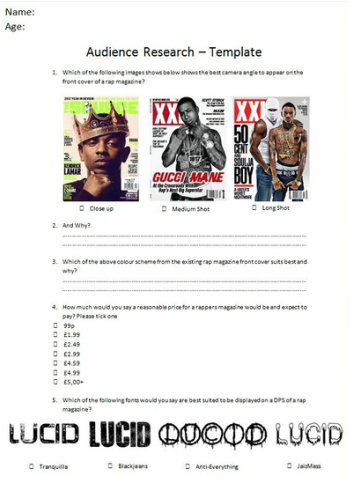
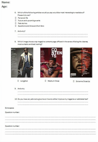
Below is a template of my audience research questionnaire.
Below is a template of my audience research questionnaire.
|
|
|
Below is a clear understanding of what people have answered into separate age categories and after I will compare to get a overall conclusion/evaluation to see how my target audience can help me shape my magazine, because after all they are the ones who are buying the product to read.
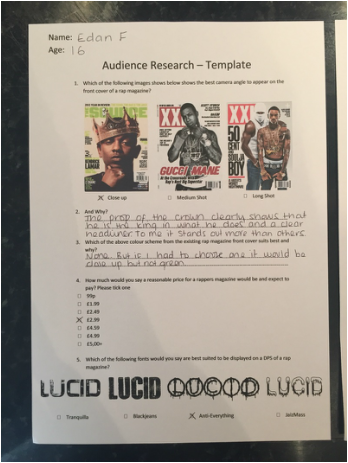
Age category 16-17
|
|
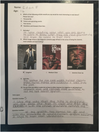
Here I have discovered that this person prefers the camera angle to be a close up as it shows the best scene of intimidation and that he does not like any of the colour schemes. This person would expect to pay in the region of £2.99 and that the font style anti-everything is best suited. He also continues to answer the questions provided to say that he personally would like to read about future and upcoming events as well as questions and answers from fans. Lastly this 16 year old says that the long shot would suit best to this magazine contents page because it shows off his success the best. Finally he provides me with advice about comparing to more examples to get the best overall opinion.
Age category 18-20
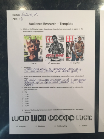
|
|
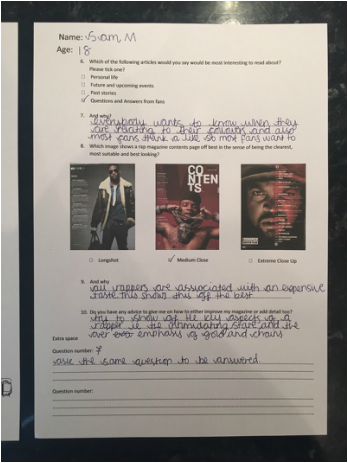
This media student has decided that the camera angle best suited for a front cover is a medium shot because it is "clear and easy to understand". He also believes that the colour scheme suited best is a mix between the medium shot and long shot front cover because its a fresh mix between new and old school. He continues to say that he would pay £2.99 for this magazine and that "Tranquilla" is the best font suited. Furthermore he believes the articles should be about a question and answer between fans because "everybody wants to know when they are relating to their followers and also most fans think alike and want the same questions to be answered". Medium shot for contents page and his advice for me is to over emphasise the gold chains due to that the stereotypical image of a rapper.
Ages category 21+
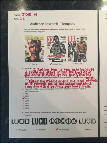
|
|
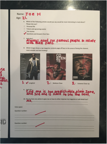
This previous media student aged 21 has told me that he prefers the medium shot for the best camera angles of a rap magazine due to the fact "the artists shows of his bling and that he has a certain looks of intimidation which all rappers should have." something I will consider when creating my front cover. he also believes that the price should be £2.49 and that the best suited DPS font is Anti everything. Furthermore he believes that the following articles that would be most interesting is Questions and answers from fans and that the long shot would be best suited for a contents page.
Evaluation
In evaluation, for question one, I have discovered that there was clear split between two camera angles. These were a close up camera angle and a medium shot camera angle. The front cover of my magazine should be a medium shot because of the fact it shows a clear headline of an artist, it shows all of his characteristics of being a stereotypical rapper. For my image I have leaned that the model should look directly into the camera staring the readers into the eyes and have jewellery coating his body (mainly around his neck), I will do further research on that in the later dates.
I have also learned that the majority of my target audience think that the colour scheme should be kept simple, such as a black or white grey scale and this is because my target audience have told me this is what they would prefer from a comparison between three images.
Overall I have discovered that people would pay from a price range between £2.49-£2.99 for my rap magazine.
I have also decided that Anti Everything would be the font for my DPS due to the fact it represents graffiti which is associated with the genre of rap and especially the iconic A with a circle rounding the letter.
For my double page spread I have concluded that I am going to write questions and answers to the chosen rapper of that week. This is where fans can send in questions via our twitter page or email.
Lastly I have discovered that there is a split decision of a camera angle for my contents page. To decided which one I am going to use I will create two contents pages (one being a long shot and the other being a medium close up) and yet again ask my target audience which they prefer.
