Content Analysis
A comparison between four contents pages and what I have learnt from analysing them.
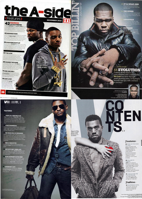
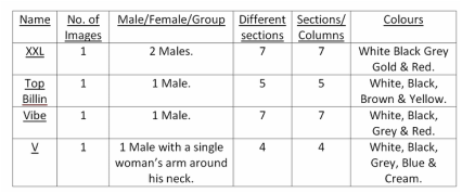
XXL;
XXL has one main image which consists of two young, muscular, black, stereotypical rappers from the pose they are displaying and showing off as much gold and other expensive items as possible. I have researched many Rap magazines for their contents page and have realised that on all other rap magazines they tend to limit to either one or two images only. This is most likely because people don’t want to see various images around the page displaying everything in the forthcoming article, they just want to just see one big image of who the main article is going to be about which in theory should decide to the reader if he/she is going to continue to read or opt for another style of magazine. There are 7 different sections/columns used on XXL which all relate to what they are going to see throughout the magazines. An example of this is the ironic name of “Little Friend” referring to Soulja Boy (The main man with all the gold in the picture positioned to the right of the text) as it describes a upcoming interview further into the article. The Contents page also consists of various different colours. The background is white which brings out the models (who are dressed in black) away from the foreground then on top of that the models gold chain further emphasis itself on the page even supporting the stereotypical idea that rappers love to show there expense with items such as gold, guns, drugs and any other items that out worth extreme value.
TOP BILLIN;
This contents page has the look of a very aggressive and intimidating black male. His hands are reaching out to the target audience which shows/promotes the expense of the ring. Another aspect could be that he is ready to fight, because, if someone was to sit/stand with their hands in front rather than behind it can be seen as an act of aggression. There is one male filling up the whole of the page which shows to me that he is clearly important and clearly the main man of the future article. There are 5 different sections/columns which fill the rest of the page that the artist is not filling himself which explain in a brief description what is on each page. The main colours used in “TOP BILLIN” music magazine are white, black, grey. The colour scheme used matches perfectly as they are all around the same area in the colour wheel to blend. The grey, orbed, background really shows off the leather jacket (further showing of the value of what he is wearing).
VIBE;
Vibe shows more of a laid back style, this reminds me more of a pilot looking style which throws the idea of private jet and expense at me. There is one black male in the foreground, representing the main image, with a darkened background. The darken background yet again presents the main image to the readers eyes as the most important feature on the page as after all the front cover, contents page and main article is what is going to make the viewer buy the magazine and read the following articles. There are 7 different sections/columns which fill the rest of the page that the artist is not filling himself which explain in a brief description what is on each page yet again like all other contents pages this is to direct the reader quick access to the article they want to read. The main colours used here are white and black for the background, text and the main artists himself and navy blue of the denim jacket to give it that extra top gun looks.
V;
V has one single black male positioned to the left of the page. Note that not many rap genre magazine have people place directly in the middle, exempt from the second contents page of “Top Billin”. There are 4 different sections which are smaller than the others and less detailed mainly because it’s about the single image on the page being the main article. The main colours used here white black and grey as a basic colour scheme and also reveals a red velvet object shaped like a heart which is the only colour on the page probably represents a meaning that everyone has a heart.
